Billets vedettes
La fin d'année, c'est l'heure des bilans, c'est l'heure des récompenses ! Et cette année, sur le blog, ce sera l'occasion de faire les Gulix d'Or ! J'ai décidé de pas faire de Top 10 ou autres. Juste un Gulix d'Or dans pleins de catégories. Et un dauphin à chaque fois. C'est …
This blog and website is mainly in french. But I try to get it in english too. You can always check the games I've written in english.
Here's also an index of the posts in english.
Billets récentstous les billets
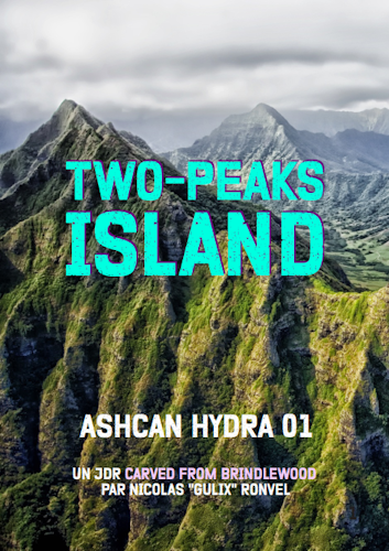
Cela faisait longtemps que je n'avais pas donné de nouvelles de Two-Peaks Island. D'autres projets de création étaient passés devant, et le sont en partie toujours. Mais avec l'été, avec la possibilité de bientôt lancer une nouvelle campagne, je me suis dit qu'il était d'y revenir. Et pour cela, quoi …
Cette livraison de culture s'avère chargée ! Parce que j'ai un peu tardé à la poster, et parce que les temps ont été propices à découvrir et finir des choses. J'ai essayé de mettre un peu d'ordre là-dedans, en regroupant par types de média. Du cinéma, du roman, du comics, des …
Côme Martin a sorti un jeu qui s'appelle Rambo, Rimbaud & Rainbow. Milouch a enchaîné avec Curie, curry et Curry. Et ça commence à faire boule de neige. Alors que j'avais autre chose à écrire, que mon cerveau était branché sur autre chose, ces bêtises ont germé et décidé que je …

Il y a quelques semaines, j'ai tenté l'abonnement à ShadowZ. C'est quoi ShadowZ ? C'est une plateforme de streaming, comme il en existe (trop?) d'autres, mais qui a décidé d'être concentrée sur un genre précis : l'horreur. La plateforme et française, et je ne connais pas son accessibilité en dehors de nos …
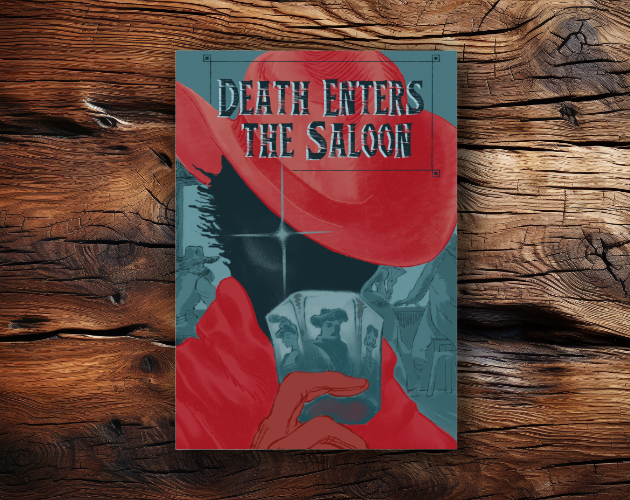
Une revue de lecture de JDR qui va mettre à l'honneur aujourd'hui des auteurs et autrices non anglophones, mais francophones et italophones. Pour changer ! Death Enters the Saloon Un JDR italien, ce n'est pas courant par ici. Mais la scène italienne du JDR se porte bien, et ce jeu alternatif …
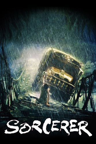
Je poursuis mes comptes-rendus culturels avec des choses diverses et variées, notamment pour cause (ou grâce à ?) de défi créatif et de vacances chez mes parents. Et j'en ai gardé sous le coude pour un article à venir un peu spécial. Le Convoi de la Peur - Sorcerer Je me suis …
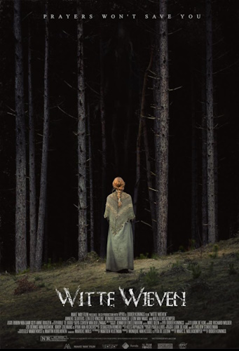
Donc, on enchaîne sur les billets autour de ma consommation culturelle. Variée, très variée. Avec de l'excellent et du OK. En espérant vous donner envie de découvrir de nouvelles choses. Hérésie - Witte Wieven J'avais rapidement entendu parler de Hérésie (Witte Wieven en version originale) lors de l'épisode sur le …
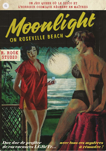
On reprend de bonnes habitudes et on essaie de dépiler un peu tous ces JDR en attente. Bien sûr, la pile est désorganisée et des choses que je n'attendais pas débarquent et viennent prendre la place de ce que j'avais prévu de lire. Moonlight on Roseville Beach, de R.Rook …
Quand on laisse traîner l'écriture d'un billet, et qu'on passe son temps à découvrir de nouvelles choses, et bien, on se retrouve avec un billet très rempli de bien bonnes choses. N'hésitez pas à scroller, il n'y a pas que le haut de la page qui vaut le coup d'oeil …
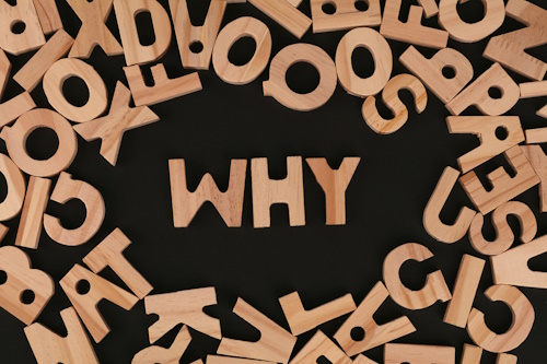
C'est une bonne question, ça : pourquoi je blogue ? Si je regarde mes archives, mes premiers billets ici (sur une autre version, mais toujours accessible) datent du 18 janvier 2007. Et vu qu'ils y en a plusieurs, je suppose qu'il s'agit d'archives d'un précédent blog. Une vingtaine d'années, donc. Un temps …